Not all food is created equal. In our age of photoshopped perfection, anything blemished is a hard sell. But when it comes to our food, visual perfection isn’t practical, or sustainable. Funny looking, misshapen, or discolored produce. Wilted lettuce. Food that says it’s gone past the sell date but looks and smells just fine. All of these contribute to a huge problem. With at least of one third of all food produced in America going uneaten every year, advocates are looking at creative ways to make positive changes in our food system, and get the public on board.
How can advocates leverage smart imagery to make the case? Here’s a hint: Not all visuals are created equal either. Our Visual Story Lab research shows that there are right ways and wrong ways to use visuals. As with most communications, thinking about your goals and your audience is the first step toward choosing the right imagery to make your case.
We’ve done a bit of digging and have found that most of the existing food waste-related visuals fall into four categories.
Welp, There’s a Problem
Infographics abound when it comes to estimating the problem. Infographics about food waste and the environment are targeted for awareness. They tend to show statistics, target the environmentalist crowd, and can be a bit lengthy (to be fair, it’s hard to encapsulate the problem into bite-sized pieces). Some infographics suggest strategies to prevent food waste, but they’re mostly heavily targeted at the consumer level, suggesting buying less, planning meals, etc. And consumers may not always be the best target for food waste campaigns.
Save Some Green
Most of the visuals on Pinterest are geared toward folks that buy groceries and cook. These are images illustrating tips and tricks to save money and reduce waste. For the budget-minded consumer, if you’re throwing out food, it’s just like throwing away money. These pictures are paired with budget-related text and show fresh, organized food with tips on how to make food last longer. The messaging is positive, encouraging and targeted to those with DIY-sensibilities. There are also tips on growing food from scraps, if you want to avoid purchasing food all together.
Clean Your Plate
Don’t you know there are starving kids in the world? Eat your peas. Just saying. So are they. This category of infographic is geared toward consumers and is centered on the shaming consumers for wasting–which we know is a bad tactic.
Ugly is In
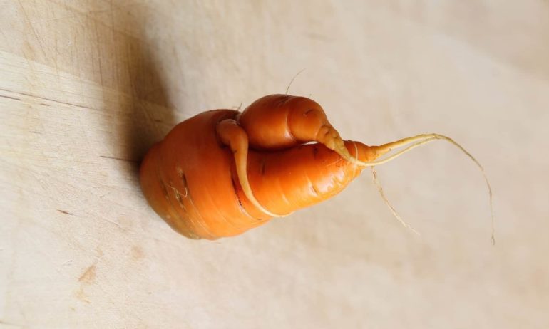
How much do we love the ugly produce campaign? Supermarkets have capitalized on the freak show of fruit, offering blemished produce at a discount…to huge success. So successful, in fact, that these ugly fruits and vegetables have their own Instagram account. These ad campaigns tend to be super clever, beautifully shot, and visually pleasing. And super memorable. This campaign has also taken on a life of its own with its message on nutrition: “a grotesque apple a day keeps the doctor away as well.”
Our big takeaway? There are a lot of food advocates using visuals in great ways, mostly aimed at consumers. But what’s missing?
Where are all the people?
Our research has shown us time and time again the power of people in imagery. Just as with our other advocacy work, images showing how people are impacted by or are working to protect these precious places to really grab viewers’ attention and boost engagement. Images and video of people doing cool things make us want to do the same things, and “norms” the behaviors portrayed. The same goes for showing good (or delicious!) results, like people preparing and eating great food from misshapen produce. Let’s face it, looking into the eyes of a potato just doesn’t have the same impact.


